I love this collection. The colours are great, as is the formula (2 coats shown). Surprisingly, I did not have close dupes for most of these, so the comparisons might not be too useful to you, but I thought I should show them anyways to help you get an idea of the colours.
Essie School of Hard Rocks - I was dying for this colour. I think it's awesome. For someone who has a lot of teals, I was really surprised to find I didn't have anything as greyed out as this shade...

Comparison: Essie School of Hard Rocks and Misa Dirty Sexy Money - I decided to compare it to one of my fav dusty teals. Totally different.

Comparison: Essie School of Hard Rocks, Orly Sapphire Silk, and CND Urban Oasis - This was requested by a reader. I don't have OPI STWD anymore XD

Essie Bangle Jangle - Nice greyed out purple.

Comparison: Essie Bangle Jangle and OPI Done Out In Deco - I had been wondering what this polish would look like against one of my favourite light purples, DOID. Turns out, the OPI is a tad warmer. I'm not sure which one I like better, though.

Comparison: Essie Bangle Jangle and Essie St Lucia Lilac - Compared with another favourite light purple of mine, Essie SLL is really different from Bangle Jangle. I feel fine keeping both :D

Essie Cocktail Bling - Yummm. Greyed out periwinkle, almost?

Comparison: Essie Cocktail Bling and Zoya Caitlin - The closest shade I have to Cocktail Bling was Zoya Caitlin from earlier this year. As you can see, though, the Zoya is much much darker (although very awesome in its own right). Love both.

Essie Size Matters - I'm always on the hunt for a good red to go with my skintone, and I think this one is great. Very blue-toned red, it almost seems raspberry on me.

Comparison: Essie Size Matters and Essie Limited Addiction - I find photographing reds to be a challenge. Actually, these are not as close as they appear. Limited Addiciton is quite a bit warmer and Size Matters is definitely blue compared to it. Both have a lovely formula though!

Essie Bobbing for Baubles - Beautiful dark blue polish. I thought it might be close to American Apparel Passport Blue, but I gave that away a while ago, so I couldn't do a comparison.

Comparison: Essie Bobbing for Baubles and Misa Office Polish-tics - the closest thing I still own was this Misa (which I adore). The Essie is really dark, but doesn't look black.

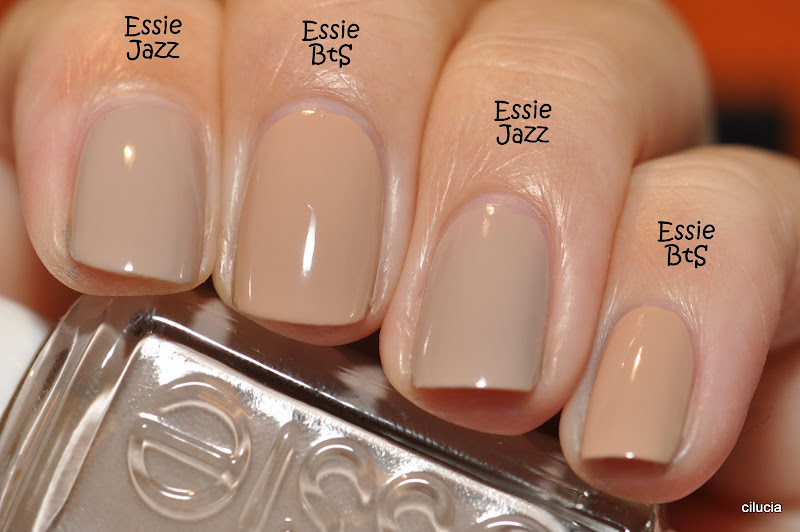
Essie Brooch the Subject - The only one I was waffling on was this nude. I don't think I like it that much on my skin tone, to be honest.

Comparison: Essie Brooch the Subject and Essie Jazz - I compared it to one of my favourite nudes, Essie Jazz. BtS is quite a bit yellower than Jazz.
Comparison: Essie Brooch the Subject and Orly Country Club Khaki - Compared to my other favourite nude, Orly CCK, BtS is also quite yellow compared to the Orly!

So, there you have it. I highly recommend this collection. It might be boring if you're not a creme-lover, but if you are... woo baby! If you guys have any suggestions for additional comparisons, let me know! I'll try to do the comparisons if I own the polishes :)
I hope this was helpful!


very helpful! and great swatches as always. My favs are blues and teal
ReplyDeleteI've been following your blog for awhile. Amazing swatches!! I'm a creme girl and a I love blues so this collection is perfect for me!! I bought School of Hard Rocks and Cocktail Bling this weekend. Gorgeous in person!! I didn't want to completely binge but I've changed my mind and going to go back for Bobbing for Baubles. If OPI has Warm and Fozzie out, those are the two I'm picking up. I'm loving the Winter 2011 collections this year!!
ReplyDeleteLove the comparion post. Great help. Thanks for taking the time.
ReplyDeleteGreat comparison post! Love the detailed pictures! Thanks!
ReplyDeleteOMG I love all of these.... They looks amazing! Thanks for the comparisons
ReplyDeleteI did a mani with SOHR and Bobbing for Baubles-they just go so well together!!! I haveyet to wear size matters but I have it!!! The rest are too light and happy for me!
ReplyDeleteGirl... Brooch the Subject looks fab on you! I have it, but haven't tried it yet... I'm holding out hope it will be my perfect nude!
ReplyDeleteAs always, your swatches are lovely! I want to wear all of these, NAO! :D
Ahhhhhhhhh so gorgeous! Thanks for the comparisons, lady -- I'm going to have to grab a few of these soon. <3
ReplyDeleteOmg I love your posts and I love Essie, so this post put me in heaven! I have heard BfB compared to Zoya Kelly and Suzi Skis in the Pyranese?? Would like to know what you think of those comparisons :) thanks for all your wonderful work!
ReplyDeletePersonally I think Brooch the Subject is your perfect nude and matches your skin tone - and I like that! Trying to resist this collection...it's hard! Thanks for awesome swatches and comparisons!
ReplyDeleteVery nice swatches and I really appreciate the comparisons! I too am a teal lover so it would be great to see School of Hard Rocks compared to some of your other teals -- maybe OPI Ski Teal We Drop, Orly Sapphire Silk and CND can't remember the name (urban??)
ReplyDeleteThanks for the beautiful swatches! Your comparisons really helped, I was really wondering about Cocktail Bling and Caitlin! Of course, more cremes are always good, especially ones that apply beautifully (:
ReplyDeleteI agree! And I love that dusty periwinkle-type shade :D
ReplyDeleteHi Karen! I added a comparison of SoHR with Orly SS and CND Urban Oasis. I already swapped my OPI STWD, so I couldn't compare that, but it's a lot darker than any of those shown, IIRC.
ReplyDeleteHaha, I'll give it another look ;) Thanks!
ReplyDeleteI don't have SSitP, but I used to have Kelly. This is the comp I did of the Misa with Zoya Kelly; they were pretty close in shade, but a bit different in undertones: https://lh5.googleusercontent.com/_9lkzxYrVJTY/TY_SuOLNKHI/AAAAAAAATWA/5lcki4KTxJg/s800/DSC_5601.JPG
ReplyDelete\o/ Love this collection!
ReplyDeleteI guess I will need to reconsider BtS... haha
ReplyDeleteNooo not too light and happy, they are lovely!!! You should try them XD
ReplyDelete*high five* Blue-creme lovers unite! :D
ReplyDeleteAt first I was not that impressed with Essie's fall and winter collections, I mean, all cremes, a bit boring eh? Yeah, right. These are so classy and chic that I've ended up buying the whole winter collection and 4 out o 6 from the fall collection haha. Love them all.
ReplyDeletehahahahhaa, you are a slave to Essie!
ReplyDeleteOriginally, my plan was to only get Baubing for Baubles, but this post has me wanting them all! Thanks for the great post!
ReplyDeleteAs always your pictures and comparisons are amazing!
ReplyDeleteGreat swatches!!! Now I need a few of those!
ReplyDeleteThanks for the comparisons, so helpful! Although I might need to stop reading your blog if I want to control my polish buying, lol.
ReplyDeleteI think I'll have to cave and get SoHR after all, definitely much lighter/more dusty than the OPI and very different from the Orly (which I have thanks to your earlier review, and I looove it!)
I was also wavering over Bobbing for Baubles and Misa Office Polish-tics has been on my want list for awhile now so it's nice to see that comparison. I think I prefer the dusty quality of the Misa.
Gosh, I went and purchase the entire collection today. Your swatches definitely helped!!! I love that your pictures are always so clear. I always seem to put a * on your entries to go back and look at, when polish shopping. You also tend to purchase what I have/will purchase, I love your blog!! :)
ReplyDeleteNelvi
joliecaramelo.blogspot.com
Thanks you for comparing Essie BtB & Jazz!!
ReplyDeleteI think I like Jazz more:)
me encarta todos los colores, solo me gustaria saver porque no pegan el color al final de los uñas esta de moda o cual es la razon por el cual dejan in espacio entre el pintar la uña esta forma pregunto pues hay mucha gente que pregunta y aveces no se sabe que decir mil gracias por mi nota
ReplyDeleteHi! I don't speak Spanish, but I think I understand your question thanks to Google Translate. I think you are asking about the "gap" left between the nail polish and nail cuticle? In pictures, the gap appears wider than it looks in real life. The main purpose, for me, is to keep nail polish off my cuticle and skin. If I don't do this, my nail polish tends to lift at the cuticle, which means my polish doesn't last as long. I also think it looks more neat, from a normal distance :) I hope that helps answer your question! :)
ReplyDeletethanks you f or your anwers I imagin abouth the your manicure and the your have the avec peoblen paint neils polish lift the cuticle thank your anwer. I hope your undertand my ingles not is very good
ReplyDelete